My Design System Skills
My Design System Skills
A highlight of my skills related to how I utilize and maintain design systems(component and style libraries on design tools)
A highlight of my skills related to how I utilize and maintain design systems(component and style libraries on design tools)
In every project I take up,
In every project I take up,
I will make sure that I will familiarize myself with existing system, and keep laying foundations for customizing or creating a system out of designs I make. For me, the design system isn’t just about following established guidelines, it’s about ensuring everything I create feels like it truly belongs in the app. By working within the system, I can easily maintain consistency and ensure users have a seamless experience throughout the app, even with new features.
I will make sure that I will familiarize myself with existing system, and keep laying foundations for customizing or creating a system out of designs I make. For me, the design system isn’t just about following established guidelines, it’s about ensuring everything I create feels like it truly belongs in the app. By working within the system, I can easily maintain consistency and ensure users have a seamless experience throughout the app, even with new features.

Colour Style
Spacing
Text Style
Components
Colour Style
Spacing
Text Style
Components
Colour Style
Spacing
Text Style
Components
key elements I focus on when working with design systems:
key elements I focus on when working with design systems:
How did I create color styles?
How did I create color styles?
How did I approach Color Styles in my previous projects?
How did I approach Color Styles in my previous projects?
In my past work, I’ve had the opportunity to develop design systems for various projects, each presenting its own unique set of challenges. Let me walk you through two recent examples: Okkular and VirtuFit, to show how I adapted my approach based on the specific needs of each project.
In my past work, I’ve had the opportunity to develop design systems for various projects, each presenting its own unique set of challenges. Let me walk you through two recent examples: Okkular and VirtuFit, to show how I adapted my approach based on the specific needs of each project.
Project: Okkular web app
Project: Okkular web app
For Okkular, the goal was to create a new color palette, ensuring it to represent the brand effectively with better accessibility standards to enhance the overall user experience. Although Okkular had existing brand colors, they were outdated and not optimized for the app.
For Okkular, the goal was to create a new color palette, ensuring it to represent the brand effectively with better accessibility standards to enhance the overall user experience. Although Okkular had existing brand colors, they were outdated and not optimized for the app.
Here’s how I approached it:
Here’s how I approached it:
How did I maintain brand consistency while refreshing the palette?
How did I maintain brand consistency while refreshing the palette?
Okkular already had some brand colors, but they weren’t tailored for app usage. So, I started by gathering the old documents and design files to collect all the existing colors Okkular had been using. This helped me to maintain consistency with the brand while updating the palette to better suit the app’s design needs.
Okkular already had some brand colors, but they weren’t tailored for app usage. So, I started by gathering the old documents and design files to collect all the existing colors Okkular had been using. This helped me to maintain consistency with the brand while updating the palette to better suit the app’s design needs.

Why should I care about accessibility when choosing colors?
Why should I care about accessibility when choosing colors?
After collecting the existing colors, I validated them using WCAG contrast checks to ensure they met accessibility standards. Because it’s not just about making the palette look good, it’s about making sure the app is easy to read and use for everyone, regardless of their visual abilities.
After collecting the existing colors, I validated them using WCAG contrast checks to ensure they met accessibility standards. Because it’s not just about making the palette look good, it’s about making sure the app is easy to read and use for everyone, regardless of their visual abilities.

How did I make sure I was on the right track with the palette?
How did I make sure I was on the right track with the palette?
I looked to established design systems like Google Material 3 for guidance. Their approach to creating accessible and balanced color schemes gave me the clarity I needed, and their insights helped me apply colors in a way that was both modern and functional.
I looked to established design systems like Google Material 3 for guidance. Their approach to creating accessible and balanced color schemes gave me the clarity I needed, and their insights helped me apply colors in a way that was both modern and functional.

Where did I find inspiration for the new color palette?
Where did I find inspiration for the new color palette?
I started by exploring other modern UIs with color palettes similar to ours. By observing how they used their colors, I was able to create a palette that was both visually appealing and easy to navigate. This helped me ensure the design felt fresh while maintaining usability.
I started by exploring other modern UIs with color palettes similar to ours. By observing how they used their colors, I was able to create a palette that was both visually appealing and easy to navigate. This helped me ensure the design felt fresh while maintaining usability.

How did I ensure the color palette aligned with the brand?
How did I ensure the color palette aligned with the brand?
With all this research and inspiration, I started defining the color palette for the redesign. I kept the core brand colors but refined them to meet accessibility standards and added a few new shades that felt fresh but still aligned with the brand. This new palette had everything We needed: primary, secondary, accent, neutral, and text colors, covering all design needs.
With all this research and inspiration, I started defining the color palette for the redesign. I kept the core brand colors but refined them to meet accessibility standards and added a few new shades that felt fresh but still aligned with the brand. This new palette had everything We needed: primary, secondary, accent, neutral, and text colors, covering all design needs.

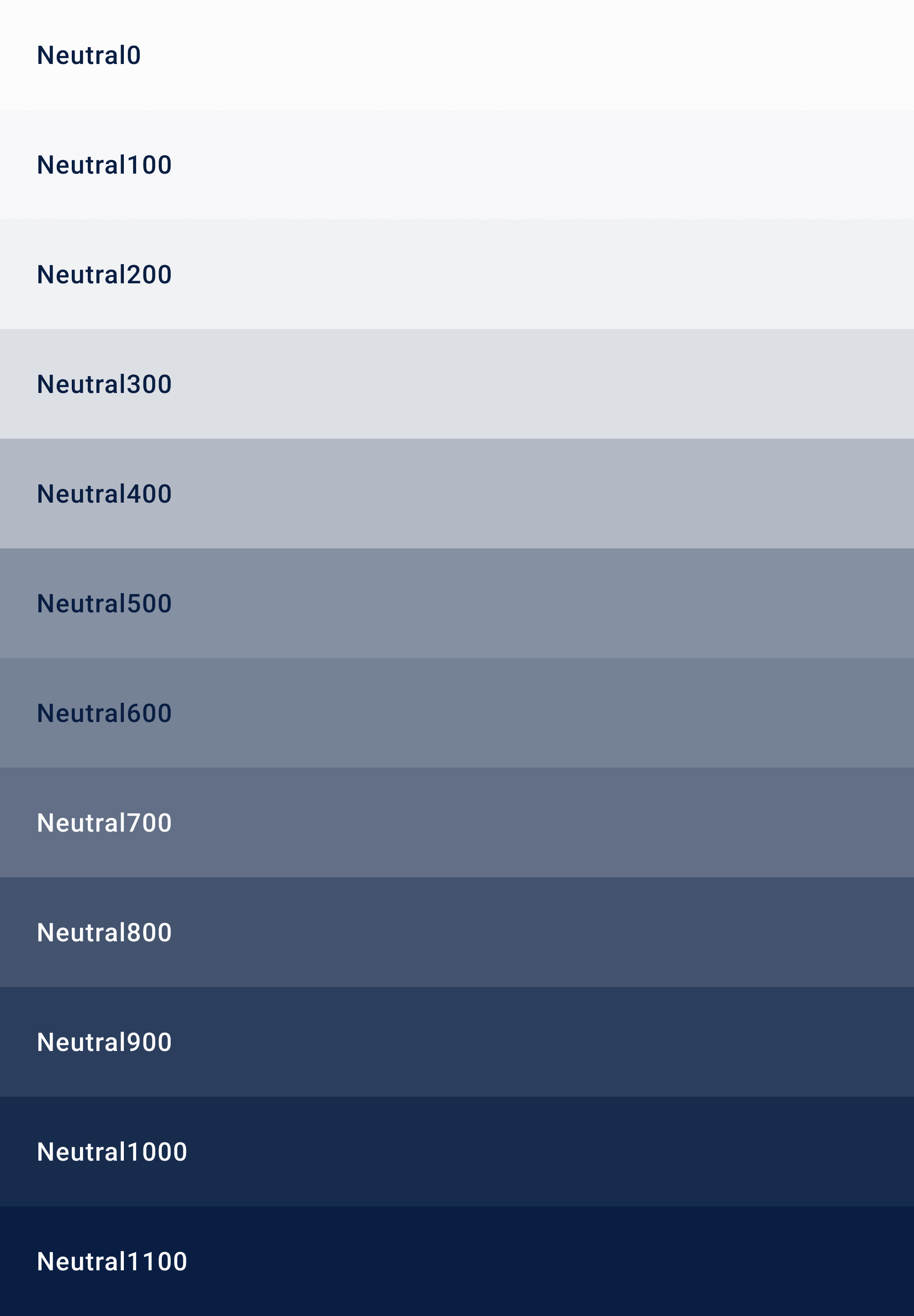
How do I make sure the color palette stays consistent across updates?
How do I make sure the color palette stays consistent across updates?
To keep everything organized and easy to use, I set up the color palette in Figma. I labeled each color category clearly—primary, secondary, surface, etc. This made it simple for me (and anyone else working on the project) to stay consistent and make updates without the risk of mismatched colors.
To keep everything organized and easy to use, I set up the color palette in Figma. I labeled each color category clearly—primary, secondary, surface, etc. This made it simple for me (and anyone else working on the project) to stay consistent and make updates without the risk of mismatched colors.

How do I use these colors effectively in the design?
How do I use these colors effectively in the design?
Finally, I integrated these colors across the design to create a visual hierarchy that guides users naturally through the app. Each color was placed with purpose, making sure interactions felt smooth and visually intuitive.
Finally, I integrated these colors across the design to create a visual hierarchy that guides users naturally through the app. Each color was placed with purpose, making sure interactions felt smooth and visually intuitive.

Before and after of web app UI on applying updated colors
Before and after of web app UI on applying updated colors

Using defined color labels in figma
Using defined color labels in figma

Structure of color label name
Structure of color label name

Examples of properties
Examples of properties

Examples of modifiers
Examples of modifiers
But with VirtuFit, the situation was a bit different.
But with VirtuFit, the situation was a bit different.
Project: VirtuFit for Myntra
Project: VirtuFit for Myntra
For VirtuFit, a virtual try-on feature designed for the Myntra app, I wanted the design to feel like it's a part of their app. My first thought was to use Myntra’s existing colors to keep things consistent, but there was a challenge, Myntra hadn’t published a design system or shared any official guidelines about their color styles publicly.
For VirtuFit, a virtual try-on feature designed for the Myntra app, I wanted the design to feel like it's a part of their app. My first thought was to use Myntra’s existing colors to keep things consistent, but there was a challenge, Myntra hadn’t published a design system or shared any official guidelines about their color styles publicly.
So, what was my approach?
So, what was my approach?
I started by observing their existing app screens in detail. I observed every detail, from the colors used in buttons, text, and containers to illustrations and even subtle elements like shadows and border colors. This helped me ensure VirtuFit looked like it belonged in the app.
I also noted how the colors changed during interactions, like hover and disabled states, to make sure the behavior of elements matched Myntra’s style. By doing this, I created a color palette that looks similar.


Defined color labels in figma
Defined color labels in figma
What did I learn from these projects?
What did I learn from these projects?
From Okkular, I gained experience in building something from scratch, balancing the brand’s identity while ensuring usability and accessibility. VirtuFit, on the other hand, was about seamlessly integrating new designs into an existing system without disrupting its flow.
Both projects highlight how I adapt to different challenges, whether it’s creating something entirely new or blending into an established framework. Ultimately, my goal remains consistent: to deliver designs that are intuitive and accessible.
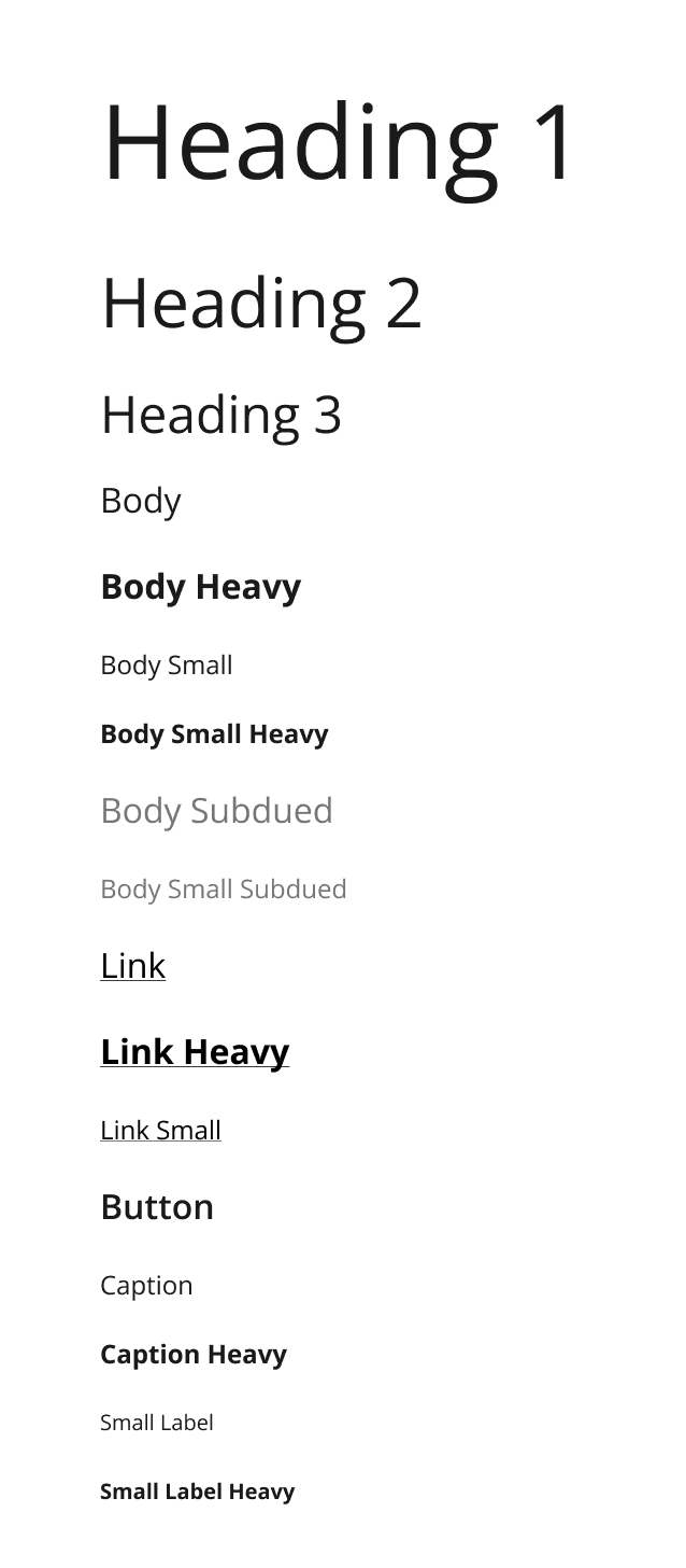
How did I define text styles?
How did I define text styles?
Just like with color styles, I took the same approach to text styles.
Just like with color styles, I took the same approach to text styles.
Project: Okkular web app
Project: Okkular web app
I started by gathering the existing brand text styles to understand the current typography. Then, I explored established design systems to learn best practices for defining scalable and accessible text styles.
I started by gathering the existing brand text styles to understand the current typography. Then, I explored established design systems to learn best practices for defining scalable and accessible text styles.

Gathering the old brand text styles
Gathering the old brand text styles

Learning from existing design materials
Learning from existing design materials

Defining text styles in figma
Defining text styles in figma

Applying text styles
Applying text styles
Project: VirtuFit for Myntra
Project: VirtuFit for Myntra
As I mentioned earlier, In this project, I didn’t have access to an official design system. So, I observed their existing app screens to trace details like text size, weight, and style. From these observations, I defined text styles in Figma that similar to their app.
As I mentioned earlier, In this project, I didn’t have access to an official design system. So, I observed their existing app screens to trace details like text size, weight, and style. From these observations, I defined text styles in Figma that similar to their app.

Tracing text styles from existing app screens
Tracing text styles from existing app screens

Defined text styles in figma
Defined text styles in figma
How did I build components and their variants?
How did I build Components & their Variants?
To make the design scalable and reusable, I focused on building components and their variants.
To make the design scalable and reusable, I focused on building components and their variants.
Project: Okkular web app
Project: Okkular web app
What patterns did I look for?
What patterns did I look for?
I started by analyzing the interface to identify repeating elements like buttons, cards, and notifications etc. This helped me understand the scope of components needed for the system.
I started by analyzing the interface to identify repeating elements like buttons, cards, and notifications etc. This helped me understand the scope of components needed for the system.
How did I design the components?
How did I design the components?
I didn’t just focus on the appearance, I considered the different ways the elements might be used, the scenarios where it would appear, and how it should behave in various situations.
I didn’t just focus on the appearance, I considered the different ways the elements might be used, the scenarios where it would appear, and how it should behave in various situations.
Let's take button, for example:
Let's take button, for example:
I created buttons with a various types—primary, secondary, ghost, danger, and warning. For each type, I also defined interactive states like enabled, hovered, and focused. Each type was created to consider different user actions and use cases.
I created buttons with a various types—primary, secondary, ghost, danger, and warning. For each type, I also defined interactive states like enabled, hovered, and focused. Each type was created to consider different user actions and use cases.


Flags with variants to highlight different types of feedback for user actions.
Flags with variants to highlight different types of feedback for user actions.

Breadcrumbs with variants for navigation paths
Breadcrumbs with variants for navigation paths

Section messages with variants to provide different types of information about a section or page
Section messages with variants to provide different types of information about a section or page
Project: VirtuFit for Myntra
Project: VirtuFit for Myntra
How did I design the components?
How did I design the components?
Since VirtuFit was designed for Myntra’s app, I started by observing reusable patterns in Myntra’s existing screens. I replicated necessary elements like buttons and cards to maintain visual consistency.
Since VirtuFit was designed for Myntra’s app, I started by observing reusable patterns in Myntra’s existing screens. I replicated necessary elements like buttons and cards to maintain visual consistency.
What happened when I needed some new elements?
What happened when I needed some new elements?
As the project progressed, some features required components that didn’t exist in the current app. When this happened, I designed new elements by taking inspiration from Myntra’s existing patterns. This way, the new components looked and felt like they belonged in the app.
By combining what already worked with new ideas, I was able to keep the design consistent while adding new features smoothly.

Replicated reusable components
Replicated reusable components

Replicated reusable components
Replicated reusable components

New elements inspired by existing design
New elements inspired by existing design
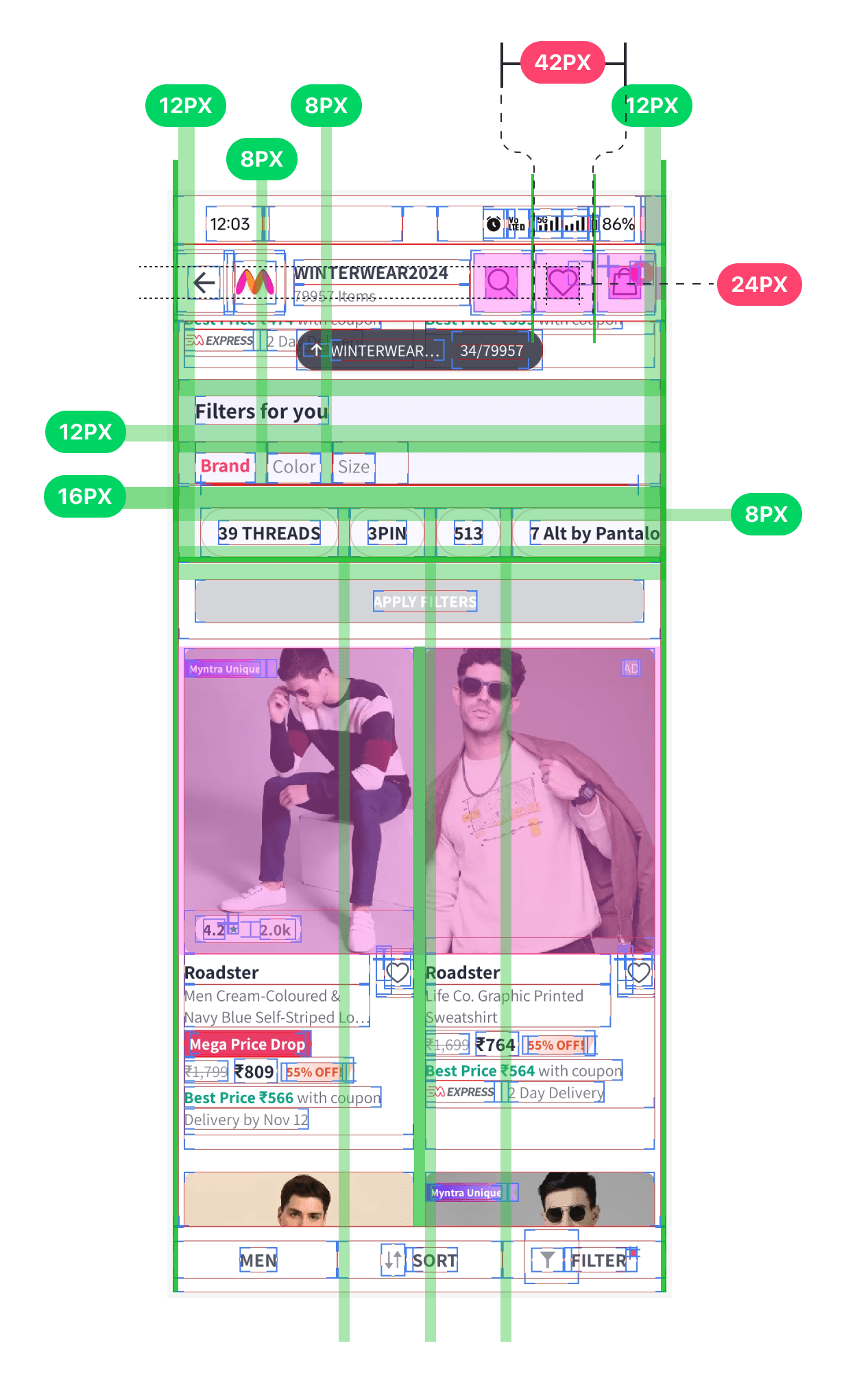
How did I handle Spacing?
How did I handle Spacing?
In the Virtufit project, I needed to make sure the new features had consistent spacing with the existing app. Since I didn’t have official guidelines for spacing, I used the developer mode to trace the spacing used in the current screens. By doing this, I could replicate the same spacing in my designs, ensuring everything felt cohesive.
In the Virtufit project, I needed to make sure the new features had consistent spacing with the existing app. Since I didn’t have official guidelines for spacing, I used the developer mode to trace the spacing used in the current screens. By doing this, I could replicate the same spacing in my designs, ensuring everything felt cohesive.
You can see in the image below how I captured and applied these spacing patterns across the app.
You can see in the image below how I captured and applied these spacing patterns across the app.
